My role:
-
User research
-
Prototyping
-
UI design
-
User experience
-
Building the product from zero
-
Branding & Merch
Purple Papaya started as an internal experiment. I wanted to help users find unique restaurants and eating experiences world wide.
Very first wireframes
With the restaurant pages as the main touch points, I set up my app's architecture based on the two main use-cases: 'I want to find restaurants opened at the times I want' or 'I want to find restaurants nearby.'
Having gone through a series of iterations I landed with a pretty simple search bar which allowed to easily type the location where you wanted to search for restaurants. In addition a little papaya button was also added which, by using your current location, it searches restaurants nearby.
The next big challenge was figuring out the most meaningful organisational logic for the restaurants that were going to be displayed as well as the information within each restaurant's individual page.

After updating my wireframes to incorporate the recommendations, I moved on to visual design. I looked for inspiration for the mobile app on Pinterest.

For the final steps the color scheme was defined and the complementary corporate design such as business cards and cute merch.

The challenge:
Help food adventurers around the globe to find crazy and unique culinary experiences by locating crazy and eccentric restaurants world wide and around their area.
To be sure the right problem was being addressed, I designed my process around regular cycles of prototyping as well as user sessions, validating every step of the way with their input. My starting point was picking up a popular travel destination and make a list of odd and eccentric restaurants organised by popularity.
Focusing on the utility of finding restaurants nearby, I decided to strip the restaurant information to the essentials.
The app was meant to be simple, therefore the menu only consists of 3 elements: favourites, search and information.
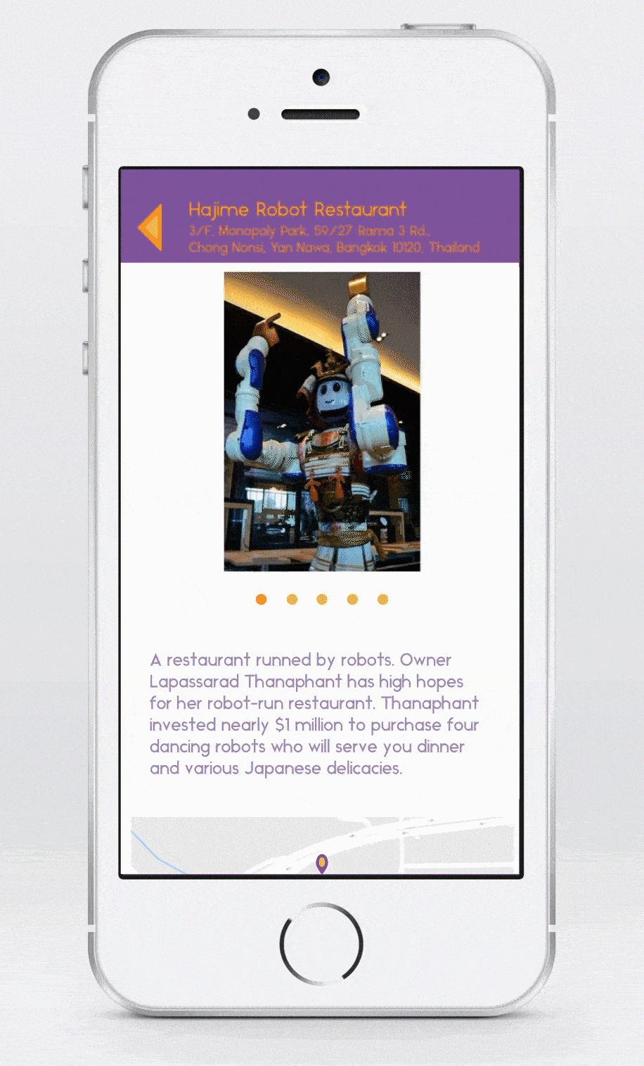
Based on the user sessions and feedback, the restaurants are shown as a list with a little picture to the left, followed by a short description and the distance. Also as part of the users suggestion, more pictures of the restaurants were added in the individual pages. These being "odd" and eccentric restaurants, the users wanted to have a better overview on the place and what makes them unique.
Next, I started brainstorming logos. Coming up with brand adjectives helped me narrow my vision. I sketched ideas first, and then created digital versions of my favourite.


